¶ Representative Collections
Below Image shows the empty state of Representative collections page
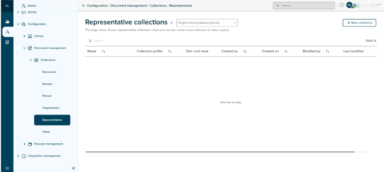
- Name - Name of the collection will be displayed under this column area.
- Collection Profile - Name of the collection profile will be displayed under this column area.
- Default confidentiality level - (Information yet to filled)
- Created by - Creator Name will be displayed under this columm area.
- Created on - Created Date and Time will be displayed under this column area.
- Modified by - Last modified creator name will be displayed under this column area.
- Last Modified - Last modified Date and Time will be displayed under this column area.
Sort
A Sort icon is present against every field which allows a user to sort and display the data in either ascending or descending or in a default order.
Total
Total Field shows the number of profile are available in the profiles overview page.
Search
Search Field is available to search any particular profile in the overview page.
¶ Creation of representative collection
Home page has New Collection Button to create the representative collection, upon clicking on the button, new page will displayed as shown below.
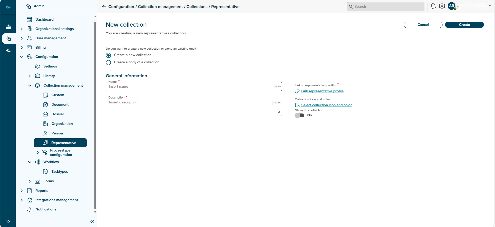
Provide collection and Description details in this Page, and click on Link representative profile link to select the profile.
Upon clicking on the linke, side panel will be opened to show the dropdown to select profile. After selecting a profile, Link button can be cliked.
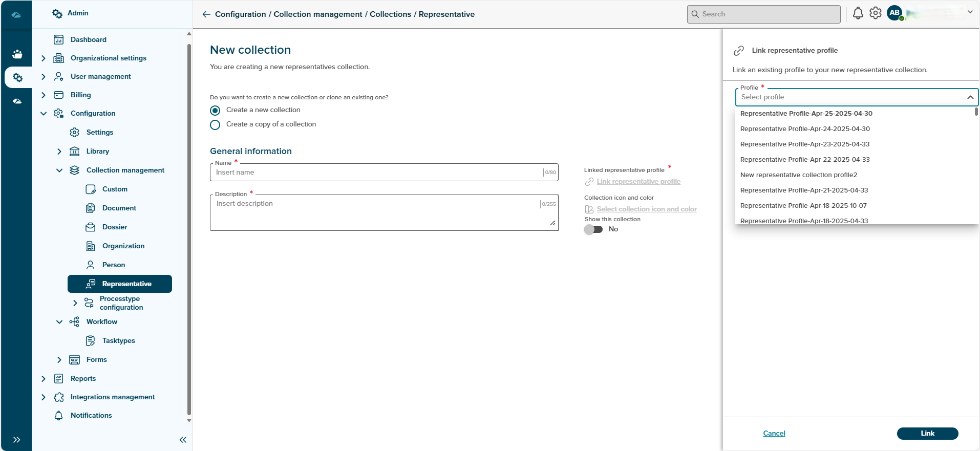
After linking the profile, user will be returned back to representative collection creation page. Here we also have an option to select to show the collection field, which is toggle button, selecting this field will make this representative collection available to the User in the DMS Runtime App.
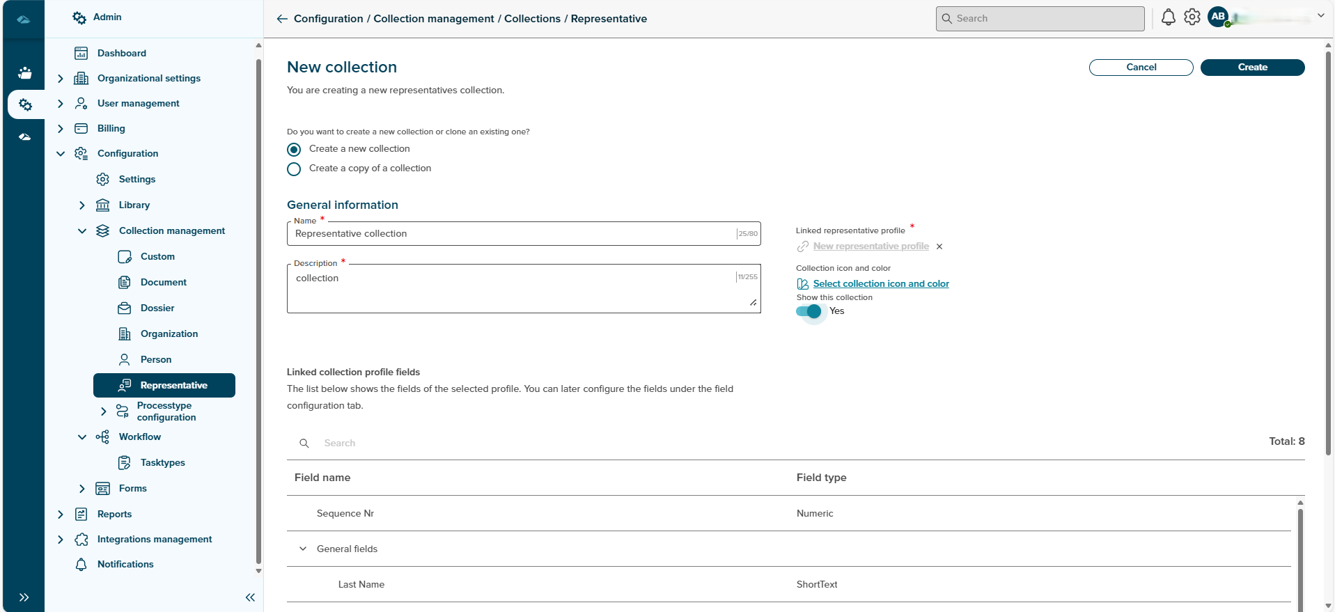
After all the information are filled, create button can be clicked to complete the representative collection creation process. Cancel button can also be clicked to abort the process.
After clicking on the Create button, user will be landed in the details page of representative collection. user can see General information tab by default
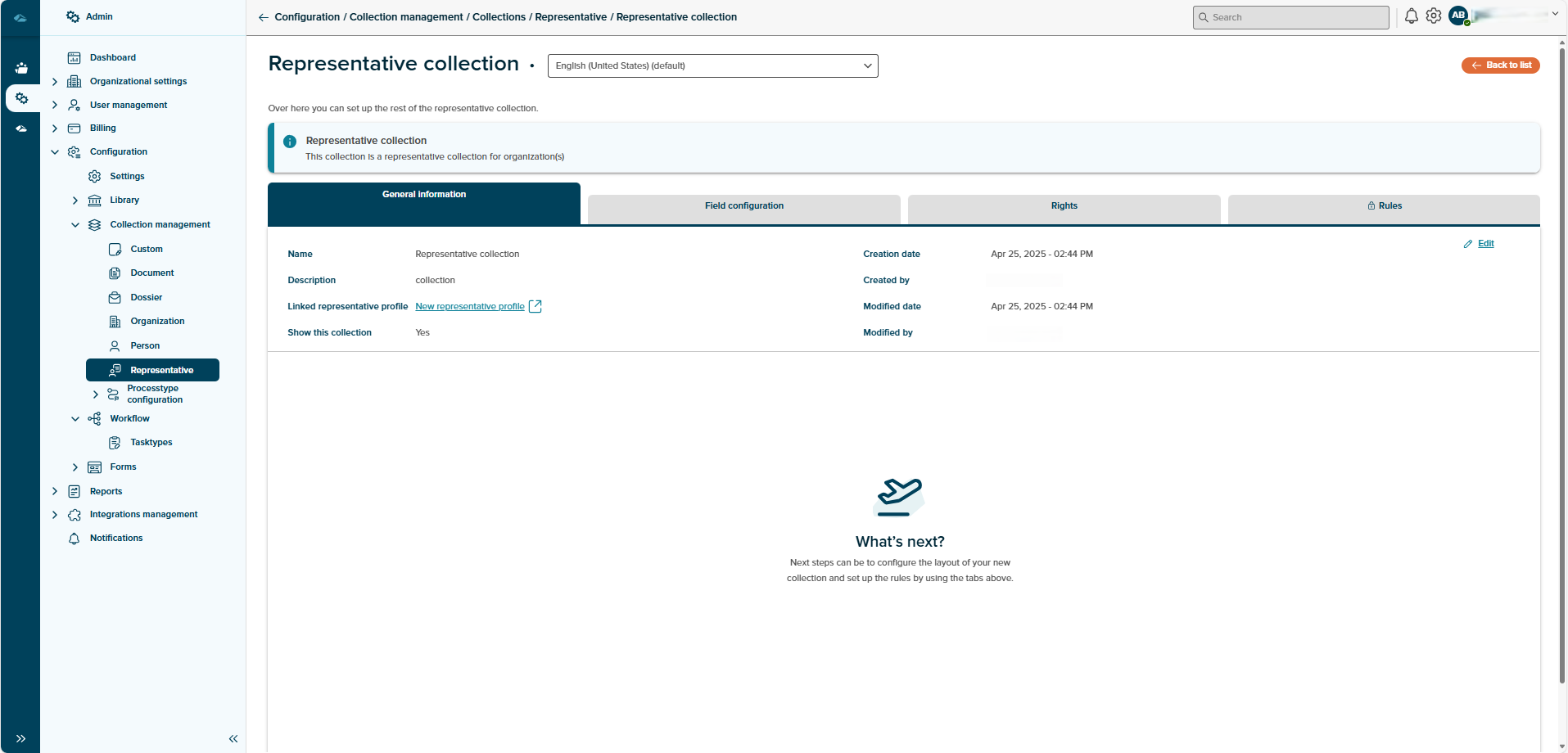
Details page of representative collection has four different tabs, they are as follows:
- General Information : representative collection Metadata will be displayed here.
- Field Configuration : Fields which are part of the representative profile linked to this representative collection will be displayed.
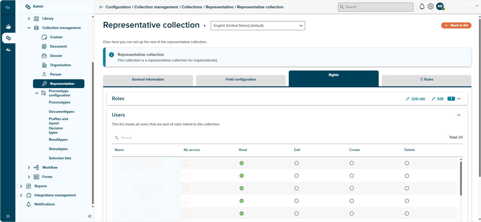
- Rights : Admin can see Roles and Users tabs. In Roles admin can find list of all all roles attached to that collection and In users admin can find list of all users attached to that collection.
- Rules : (Information yet to be filled)
¶ General Information
Metadata of representative collections can be edited here, by clicking on the Edit button.
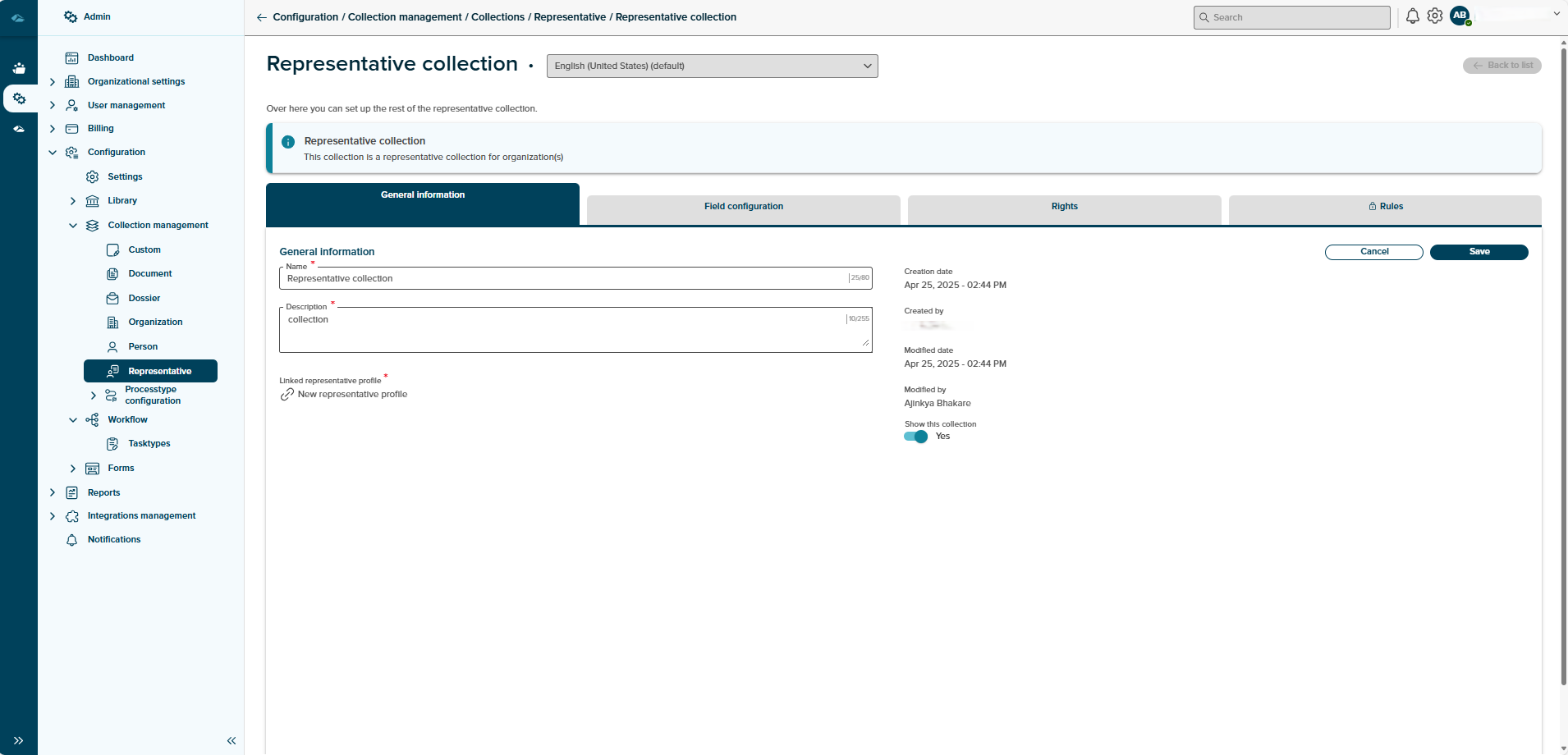
Upon clicking on the Edit button, name and description field will be displayed in the editable mode. Here user can update the information and click on save button.
¶ Field Configuration
Upon clicking on the Field configuration tab, admin can see the default fields and admin user added fields in the Layout. This page will also have side block where admin can see the available fields and different types of elements, which can be used while configuring the collection.
In the available column area, each of the fields are configurable, it can be done by clicking on the field.
On clicking the field, side panel will be opened to show the properties of that field.
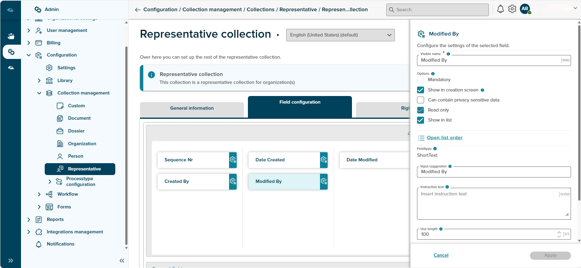
Different properties are available in the side panel which are specific to that field, they are as follows.
- Visible Name : This shows the name of the field, it is a editable field
- Options : Here we can set different parameters for the field, to make the field either manadatory or
- Field type : This will show the which type of field it is.
- Input Suggestion : This shows the input suggestion for field.
- Instruction Text : In this field admin can set the instruction text, which will be displayed in the form to user while entering value in it.
- Use Length : In this field admin can set the character limit for the field, it can be done by entering the numeric value.
- Default Value : In this field admin can set the default value for the field which will be displayed in the form to the user.
Admin Can Remove the fields from the column area and move to the available fields area in the side block by dragging and dropping in the available field block.
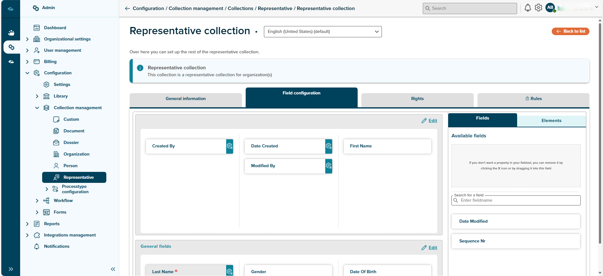
Admin can add the additional column area by clicking on the New Column Area button, clicking on this will add the new column area/layout in the page.
These column area can be configured, by clicking on it, Elements side panel will be displayed for newly added column area.
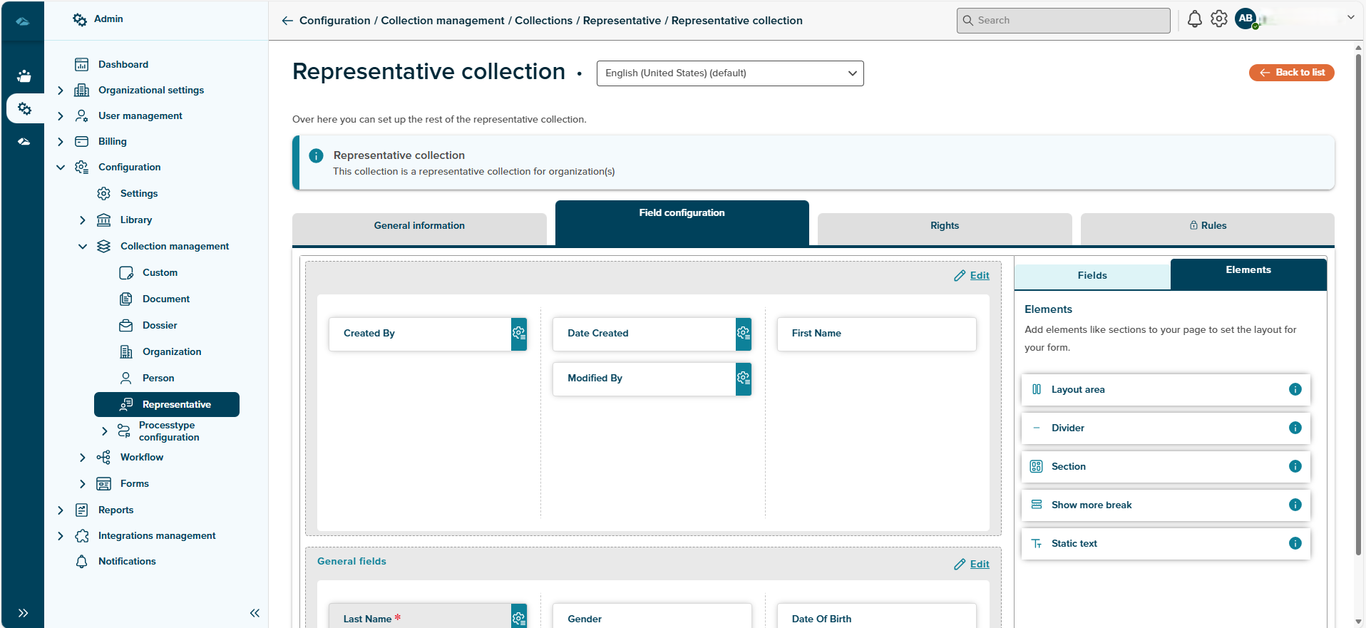
Elements have different attributes which help to set the layout for the form, they are as below
- Layout Area : New column can be added by draggin in the items from layout area options
- Divider : Dividers allow admin to place a line between two elements, creating a visual distinction between the two.
- Section : Create a new area to fill with columns and groups. This allows admin to divide the content into blocks!
- Show more break : A see more break allows admin to hide fields in a collapsable section. This makes pages with lots of information easier to read.
- Static text : Use this to add static text to the form
In this tab, there is a option to preview the configuration done by admin, by clicking on preview button a new screen will be displayed.
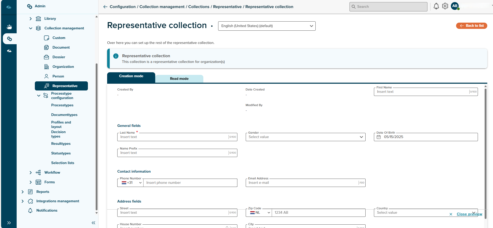
New Page will have two tabs such as creation mode and read mode.
- Creation Mode : This Form is completely set and configured by Admin This page will be displayed during the creation of representative in the user end application.
- Read Mode : This form is configured by admin, the details here will be displayed in the details of the representative.
Close Preview button will be available to close the preview mode, after clickin on button, it will be return back to field configuration page.
In the Field configuration tab, we have information AutoSaved which displays the time from last latest changes.
¶ Macros
Macros are the smart capability which are provided within the platform. Macros are programmable expressions used to dynamically evaluate values based on field data, conditions, and functions.
Click on the below link to understand more about macro and how it is implemented in document management system.
¶ Rights
In the Rights tab, the user can see the Roles and Users tab. If the user clicks on the Roles tab Admin can see a list of roles that are attached to that collection. Admin can also link new role by clicking on button link Role
Admin can also change the rights by clicking on the edit button
Admin can also unlink a role by clicking on the Unlink Role button which is available in the kabab menu of the role
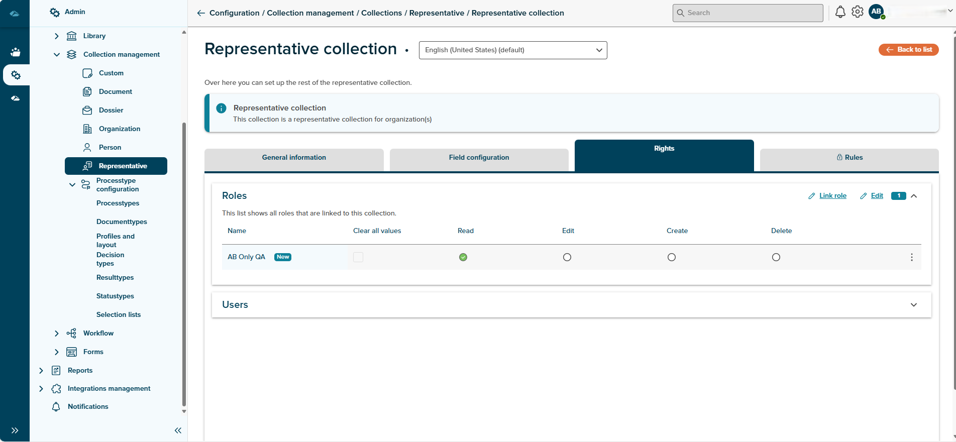
In the Users tab admin can see the Load list with users button by clicking on that button admin will get the list of users who are linked to that collection through Role.
